Exploring Australian indigenous bible translation

Everyone deserves to have access to the bible in their native language.

Given the large number of Australian indigenous languages, I wanted to see how far data could take me towards answering the question Which Australian indigenous language group is most in need of bible translation?

It turns out that data can go a long way. As to the question itself:

Spoiler: It’s the Kukatja people in Western Australia.

I answered this question by writing some software to aggregate data on bible translation efforts, language groups, language relationships, speaker count and locations and English language competency. I used data from the Joshua Project, the World Atlas of Language Structure (WALS), the 2011 Australian Census, SIL’s ISO language code mappings, Find A Bible, AIATSIS AUSTLANG and Tindale’s Catalogue of Australian Aboriginal Tribes and after a bit of recent inspiration and rework I’ve published the output from the tool. Keep in mind that this was written as a proof-of-concept - the user interface has plenty of rough edges, and the data has only had limited review.

You can see it at https://language-explorer.wordspeak.org.

Why the Kukatja?

Most importantly, they don’t have any of the bible in their native language. Given the first book of the bible to be translated is usually one of the gospels, a language group with even a single book has access to the key parts of the message of Jesus. Given everyone should have some chance to read about Jesus, it’s important to prioritise a giving that first opportunity. Secondly, while the Kukatja aren’t the largest language group without bible access (that would be the Jaru) their low (self-assessed) ability in Australia’s national language, English, means that they can’t use an English-language bible either, so they’re quite stuck.

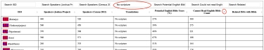
Here’s output from the software showing only language groups without a bible (filter by No Scripture) and sorted by count of non English language readers.

Language table showing Kukatja as most in need

The software also has a map of language groups, with size corresponding to speaker count and colour showing scripture access (red circles are groups without any scripture, yellow circles are groups with only a single book of scripture)

Filterable language map

The data shown in the software is a few years old, so it’s quite possible that the Kukatja and the Jaru people have a bible translation underway, but I think there’s promise in combining a data-driven approach with God’s leading as we work towards giving everyone access to the bible in their native language. If you’re interested in current Australian indigenous bible translation efforts, take a look at Aboriginal Bibles.

The source code for the software is available on Github

Accessibility - the old gray mare, she ain’t what she used to be

My eyes aren’t getting any better as the years pass, and so I’m more aware of things that improve website usability for those who don’t have awesome vision or who read the web through a screen-reader.

I’ve recently improved the accessibility of this site by increasing the contrast of page elements and providing better information for a screen reader (removed redundant information and added it where it was missing).

If you’re wanting to improve the accessibility of your site (and it’d be great if you did), you’ll get some practical, easy-to-implement guidance from the Accessibility section of Chrome’s Lighthouse audit tool and from WebAIM’s WAVE tool. Even if you pick a few higher priority suggestions and come back to the others, it’ll be an improvement for someone with reduced vision who reads your site. Future you says thanks.

Making the Touch Bar useful

I’ve had a Touch Bar equipped Macbook Pro for about 6 months. Until recently, I only used the Touch ID sensor with any regularity; I couldn’t see a use for the other buttons and the switch from buttons to sliders was a usability regression. I recently read Making the Touch Bar finally useful and discovered how BetterTouchTool can be used to customise the touch bar. Wow.

Here’s my new touch bar:.

My customised Touch Bar

From right-to-left:

  • The escape key. As a user of an Apple iPad keyboard that lacks an escape key, I’ve mostly retrained muscle memory to use ctrl+[ for escape. I still use the key occasionally (and I’d still rather have a physical key).
  • Battery info. I had battery info in the menu bar but the Touch Bar is more noticeable, and the extra space allows for more info. This helps me be more aware of battery-hungry apps, and now my battery lasts longer.
  • ADSL connection info. My ADSL model exposes this info by SNMP. It was previously in the menu bar as a custom plugin for BitBar and, like the battery info, it’s more visible and useful in the Touch Bar.
  • www.wordspeak.org ping time. This is an indication of my upstream connection quality, not as monitoring. When touched, it opens an Alacritty terminal to my hosting machine, with the appropriate colour scheme.
  • Gateway ping time. Like the other ping time widget, this gives me an indication of link congestion, which often happens when devices are doing cloud backups or uploads. When touched, it also opens a custom Alacritty terminal.
  • Coffee time! Puts the laptop to sleep.
  • Volume and brightness. Buttons, not sliders. The Touch Bar is a small target, and I found it hard to set the brightness or volume correctly with the sliders that Apple uses in the default configuration.
  • Weather. Live, local weather from the Bureau of Meteorology implemented in shell
  • Clock. It’s in the menu bar too, but I notice it more in this location.

The Touch Bar is a well implemented piece of technology, with a poor default configuration. Paying a few dollars for a BTT licence to make it useful is a good move.

Smaller images with single-step compression

I’m reviewing image sizes to improve download times in my photo galleries and I’ve obtained the smallest file sizes by performing a single compression step rather than allowing each tool to perform compression during my image pipeline.

Each tool in my workflow has defaults that work well if there is no subsequent or proceeding compression, but produce sub-optimal results when used in an image pipeline where each tool performs compression. My workflow is:

  1. Load and edit photos in Apple’s Photos.app.
  2. Export from Photos.app. I choose a “JPEG Quality” level at export time.
  3. Stamp copyright and licencing info using ExifTool
  4. Resize images as a part of image gallery creation using Pillow, which generally involves a compression step
  5. Perform final optimisation using imageOptim. I’ve used this tool in the past to reduce JPEG sizes with great success and it’s consistently given me the best image compression. Adding this step was the trigger point for this investigation.

I did experiments on my Arches gallery whose photos have a total uncompressed size of 103.6MB. I tried four permutations of compression with the results below, noting that the Pillow step also includes resizing:

  1. Compression by Photos.app, Pillow and imageOptim: Final size 4.6MB
    • Photos.app (medium quality) 103.6MB → 19.1MB
    • Pillow (75% quality) 19.1MB → 5.2MB
    • imageOptim (74% quality) 5.2MB → 4.6MB
  2. Compression by Pillow and imageOptim: Final size 4.6MB
    • Photos.app (maximum quality) 103.6MB → 103.6MB
    • Pillow (75% quality) 103.6MB → 5.2MB
    • imageOptim (74% quality) 5.2MB → 4.6MB
  3. Compression by JPEGmini and imageOptim: Final size 4.3MB
    • Photos.app (maximum quality) 103.6MB → 103.6MB
    • Pillow (100% quality) 103.6MB → 27.8MB
    • JPEGmini (no user-selectable settings) 27.8MB → 7.1MB
    • imageOptim (74% quality) 7.1MB → 4.3MB
  4. Compression by imageOptim only: Final size 4.1MB (best result)
    • Photos.app (maximum quality) 103.6MB → 103.6MB
    • Pillow (100% quality) 103.6MB → 27.8MB
    • imageOptim (74% quality) 27.8MB → 4.1MB

The best result comes from performing a single compression step with the best compression tool.

I expected that the individual compression tools would have complementary compression schemes and chaining them together would give the best compression. I suspect now that imageOptim uses all the types of compression schemes available in the other tools and gets the best result because it can take an image with low entropy i.e. an uncompressed image and introduce all the entropy (compression) in a single step.

Disincentives and Photo Hosting

I’ve been searching for a simple, scriptable photo hosting tool so that I can move off Flickr, and I’ve found one. Photo hosting tools don’t seem to have evolved much in recent times, which is unsurprising given social media does the job of photo sharing for most people. There are a few tools, for sure, but there’s something fun about hosting my own photos so I can optimise, meddle and learn and still have the joy of sharing (and indeed sharing without ads).

So it’s time for me to say goodbye to Flickr. It’s been a good technical platform and seems to have a community in it, but I didn’t like Flickr’s injection of ads in my galleries and the platform does feel irreversibly stagnated - I was excited while when Yahoo gave it some focus a few years back, but there’s nothing to indicate anyone’s committed to developing it.

So I’ve moved my photos across to a self-hosted instance of Sigal. Performing the move was a delightful task as I relived some of the memories that I’ve previously published, and then discovered albums that I could have published, but never did. I realised my reservations about Flickr were a subconscious disincentive for publishing.

So, with this renewed vigour, I’ve published photos from my 2016 trip to Cyprus along with the rest of my photos. I hope you enjoy them.